My first example is on from Arcade Fire
This is actually my favorite example of ones that I was able to find. The viewer is greeted to an aesthetically beautiful website where birds fly around the page and even interact with the page by landing on the branch-like text on the page. The only thing that prompts the viewer is a text input box that asks the viewer to type in their address from when they were a kid. With a little bit of loading time your interactive video is ready to be played. Music in the background plays from the band and you see a man running in a strategically placed pop-up window, another window is introduced and layered behind that one. The windows continue moving throughout the screen seemingly dancing with each other and creating a feeling just with how they're moving together. Then for the best part...well I want people to do this, so I'm not going to say, but let's just say there is actual interaction with your adress you gave to the site involving the video.
Also during this time seamlessly integrated part where you're asked to write a note to yourself when you were young. The best part is you're able to submit this to the band. This is how they explain this, "The Services are an interactive art project in the manner of a music video." With reading on, it seems that they are going to take a compilation of the notes written to the viewers younger selves in a final music video. Very interesting huh? I love this whole concept because it gives users interaction with the band itself. Also, you are given a link to your letter and other users can respond, you can also make responses to other users as well. Very nice touch since this will be something that will promote users to come back to the site, especially since the note they wrote to themselves is most likely something personal and important to them. Here's a view of the note I wrote my younger self. Sorry it sounds kinda emo, but oh well; again it's personal! Click the image and you can see more detail in the way the program makes your own writing look like the branches on the homepage.
Okay, so obviously that was my favorite example of a promotional minisite. Now I'll post one that's a more obvious example of one.
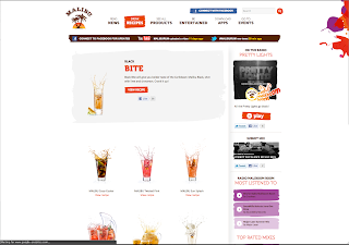
I love this example mostly for the homepage. I thought it was really daring to go against one of the norms when it comes to design and making the homepage predominantly in black and white. Then the only accents of color are the things that are most important, the logo and the beautiful product shot. (I sometimes think about the pitches to clients and what they were like, in this case I wonder what Malibu thought at first not being typical and doing things in black and white). This site is actually really interactive and well designed. I love how later in the site you're able to see that they introduce the color fully through the website. There ideas everywhere that show how you can use the product, and promoting the lifestyle they want to associate with Malibu Rum. Overall I feel this is a great example of a traditional minisite for a product.


Love the idea of "going against the norms!"
ReplyDelete