
My own advertising work & my favorite examples of ads.
Showing posts with label Design. Show all posts
Showing posts with label Design. Show all posts
Thursday, August 25, 2011
Stop-Motion
Not to be overly posting, but my goodness, this is wonderfully done! God knows if I get to go back to school I would totally go back for motion media or animation...or photography. Maybe I'll just do them all to get it over with. Here's an amazing example of stop motion photography.
Friday, July 15, 2011
New Design
So with the redesigning of all of my personal promotional materials I decided to stream line everything that I have online for an idea of what my things will look like. The theme? A girl with a love of cars. :] Here's a preview of the new business cards. We'll see how everything goes, really just working on the formatting right now, and TRYING to figure out the paper that I'll be printing on. Excited though. Roughs will be due monday, printed on that mysterious paper I have yet to decide on. Also, want to add that I'll be using my own handwriting where you see my name in a computer script font.

Enjoy!

Enjoy!
Saturday, July 2, 2011
Another Quarter/Last Quarter
Here it goes! Time for my last quarter here at SCAD, I'm really excited to be able to redesign everything I've done so far at school (though I'm rather intimidated in the same). The job searching has started and I have a few places in mind that I'd really like to work :]. I'll be keeping everyone up to date with how I'm doing in my classes and what I'm redesigning and when. I just hope that in the end I can come up with some decent advertising! I'll also be posting weekly what I'll be putting onto the advertising blog we have for class.
Have a great night everyone! And also have a wonderful 4th of July!
Have a great night everyone! And also have a wonderful 4th of July!
Saturday, April 23, 2011
Sharpie Liquid Pencil Final
So, I had said I would post the finals of this project the night before it was due. Well, funny story! I had no idea what I was getting into. Finishing the final drawings for my project/putting everything together took forever to say the least. I wasn't able to go to sleep. Basically I was awake from 9:00AM Wednesday, and then was able to go to bed at 10:30 PM on Thursday (after both classes and a lecture that turned out to be two lectures combined into one.)
Crazy.
Anyways, here are my finals! Sorry about the bottom part of the pictures being shifty in their alignment. It doesn't show up that way in the preview of my editor and the code isn't messed up so not sure what's happening. Oh well, again, anyways, hope you enjoy!


Crazy.
Anyways, here are my finals! Sorry about the bottom part of the pictures being shifty in their alignment. It doesn't show up that way in the preview of my editor and the code isn't messed up so not sure what's happening. Oh well, again, anyways, hope you enjoy!
 |
| Print ads part of the campaign. All read a tag, change your mind at Sharpie.com. This tag works on two levels, you can change your mind when you're writing or using the pencil, and you can dare to change your mind about Sharpie as a brand, it's no longer all about the permanence. Another important point is that if they don't read anything from the headline, they'll see Sharpie Liquid Pencil for sure through the accent color. |


 |
| Examples of how the long headlines can translate into short worded billboards. The result is a short and witty title to call the new pencil. Keeping the dynamic way of displaying the sharpie coming into the frame of the design will be only using billboards that have off-center polls and creating them into the whole pen. |

 |
Front page of direct mail |
 |
First spread design |
 |
Second spread |
 |
| Third and final spread. The darker part shown that says save is a part that folds down and reveals the coupon underneath |
 |
Back page with the extended full version of the tagline for the Liquid Pencil. |
This is my first try ever for a copy driven headline. It went alright I'd say. :] This is what I have so far. I had originally been planning on drawing out a TV script. That had to be scrapped since I was taking on too many drawing projects in one campaign and it takes me a long time to draw so that didn't happen unfortunately. But I will finish it for this soon enough and you'll be updated. :D
Thank you for looking! And have a great day.
Tuesday, January 25, 2011
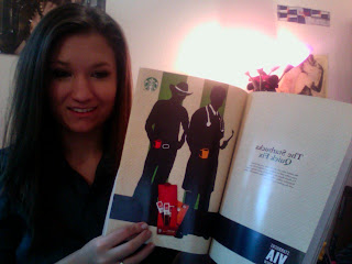
Starbucks Ready Brew Coffee Final
Here's the finals for my print ads for Sarbucks. First I'll show them in the magazines, and then I have the detailed images. :]


 |
| Insert as it would be closed |
 |
| The final printing of my insert. |


Now to take a closer look at the ads.
 |
| This is what I had wanted my insert to print as. Problem was they couldn't print double sided on a 25 inch piece of large format paper. Oh well I guess. Plus it was around 100 dollars to print one sided. *cringe* |


Sorry about the colors, and the quality of the images. I really hope everyone enjoys! :]
Subscribe to:
Posts (Atom)